
Dictionary Component
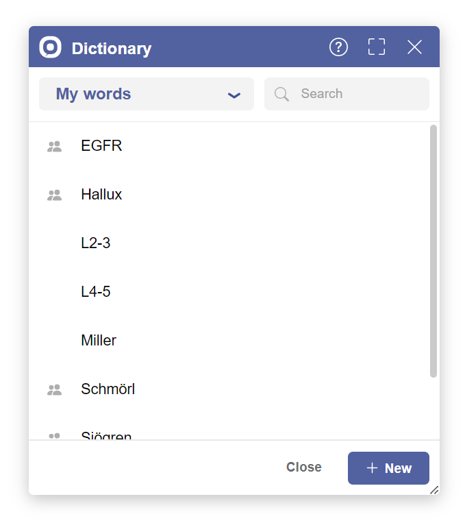
This component is available in the
libs/integrations/invox-dialogs folder of the SDK.The Dictionary Component is a modal window that allows word management. This high-level component is designed to be integrated quickly and easily in your web application.
Getting started
1. Import resources
<!-- Invox Dictation SDK - API -->
<script type="text/javascript" src="libs/invox.min.js" charset="UTF-8"></script>

<!-- Invox Dictation SDK - Dictionary Component -->
<script type="text/javascript" src="libs/integrations/invox-dialogs/invox-dictionary-component.min.js" charset="UTF-8"></script>
<link rel="stylesheet" href="libs/integrations/invox-dialogs/invox-dictionary-component.css">
1. Import resources
Import the resources in the head of your index.html.
- invox.min.js: contains the API of INVOX Medical.
- invox-dictionary-component.min.js: contains the Dictionary Component integration.
- invox-dictionary-component.css: contains the styles of the Dictionary Component integration.
   <!-- INVOX Medical SDK - API -->
   <script type="text/javascript" src="libs/invox.min.js" charset="UTF-8"></script>

   <!-- INVOX Medical SDK - Dictionary Component -->
   <script type="text/javascript" src="libs/integrations/invox-dialogs/invox-dictionary-component.min.js" charset="UTF-8"></script>
   <link rel="stylesheet" href="libs/integrations/invox-dialogs/invox-dictionary-component.css">
2. Initialize component
- Create a container in the DOM. You can use the same container for all dialog components:
<div id="invox-dialogs-container"></div> - Create the component:
const dictionaryDialog = INVOXMDComponent_Dictionary.create("invox-dialogs-container");
3. Show component
dictionaryDialog.show();
4. Hide component (optional)
The dialog can also be closed by pressing ESC or clicking the Close button.
dictionaryDialog.hide();
5. Remove component (optional)
dictionaryDialog.remove();
Public methods
create
| Function | Description | Parameters | Returns |
|---|---|---|---|
| create | Creates the element in the DOM. Not visible to user by default. | String | void |
const dictionaryDialog = INVOXMDComponent_Dictionary.create("invox-dialogs-container");
show
| Function | Description | Parameters | Returns |
|---|---|---|---|
| show | Displays component in the user interface. | - | void |
dictionaryDialog.show();
hide
| Function | Description | Parameters | Returns |
|---|---|---|---|
| hide | Hides component in the user interface. | - | void |
dictionaryDialog.hide();
remove
| Function | Description | Parameters | Returns |
|---|---|---|---|
| remove | Removes the element from the DOM. | - | void |
dictionaryDialog.remove();
Customize design
At the beginning of the Dictionary Component CSS file
libs/integrations/invox-dialogs/invox-dictionary-component.css you can
find the :root selector with some variables for easy customization.
Feel free to modify this stylesheet to adjust the component to your web design.
| Variable | Description | Default |
|---|---|---|
--invox-dictionary-dialog__z-index | z-index | 700 |
--invox-dialogs-color__primary | Primary color | #52619f |
--invox-dialogs-color__primary--hover | Primary hover color | #415491 |
--invox-dialogs-size__width | Dialog width | 400px |
--invox-dialogs-size__height | Dialog height | 400px |
--invox-dialogs-size__border-radius | Border radius | 5px |
--invox-dictionary-dialog__z-index | Dictionary dialog z-index | 700 |
--invox-dialogs-color__primary | Primary color | #52619f |
--invox-dialogs-color__primary–hover | Primary hover color | #415491 |
--invox-dialogs-size__width | Common dialog width | 400px |
--invox-dialogs-size__height | Common dialog height | 400px |
--invox-dialogs-size__min-width | Minimum common dialog width | 300px |
--invox-dialogs-size__min-height | Minimum common dialog height | 400px |
--invox-dialogs-size__max-width | Maximum common dialog height | 100vw |
--invox-dialogs-size__max-height | Maximum common dialog height | 100vh |
--invox-dialogs-size__border-radius | Common dialog border radius | 5px |
How to use
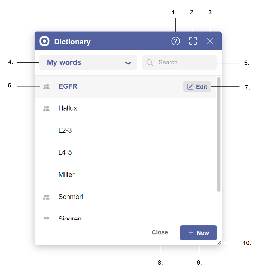
- Help button — Displays the help view.
- Fullscreen button — Enlarges the view to full screen.
- Close button — Closes the dialog.
- List selector — Filter by user items, speciality items, or all items.
- Search bar — Search items by name.
- Shared item icon — Indicates the word is shared with users of the same speciality.
- Edit button — Modify the selected word.
- Close button — Close the dialog.
- New button — Create a new word.
- Resize handle — Drag to resize the dialog.
How to create words
- Click on the “New” button to navigate to the creation view.
- Fill the gap with the new word.
- Click on the “Save” button to save changes.
How to remove words
- Select the word you want to remove.
- Click on the “Edit” button to navigate to the edition view.
- Click on the “Remove” button.
- Click again on the “Remove” button to confirm.
How to edit words
- Select the word you want to edit.
- Click on the “Edit” button to navigate to the edition view.
- Edit the word…
- Click on the “Save” button to save changes.